Streamlining content with an information architecture redesign
COMPANY
Alaska Airlines
ROLE
Lead Product Designer
TASKS
Strategic Project Leadership, User & Content Research, Information Architecture & Wireframing, Cross-functional Collaboration & Alignment.
PLATFORM
Responsive Website
TEAM
Product Design Manager
Senior UX Writer
Product Designer
Senior UI Designer
OUTCOME
Successfully streamlined the loyalty program's marketing content through an information architecture redesign, reducing pages by approximately 55% for a clearer and more user-friendly experience.
Problem
The loyalty program's marketing content was over five years old, leading to outdated information and a poor user experience. Users faced confusing navigation and information overload. Inconsistent messaging and a focus on advanced features obscured the core value proposition for potential new members. A content audit also revealed substantial redundancy, contributing to a fragmented user experience and lower conversion rates.
These issues significantly impacted sign-ups, as it was genuinely hard for potential members to understand the program's value and ease of use. To address this, I focused on a key question: How might we simplify the loyalty program's marketing content and information structure to make it easier for all members to quickly understand benefits and how to earn/redeem points? Recognizing this clear opportunity to improve user experience and enrollment, I led a strategic initiative to audit and redesign the information architecture, aiming to refresh program details, clearly explain immediate benefits, and simplify the user journey and language to increase sign-ups.
Process
My user-centered and strategic approach to this information architecture redesign incorporated key UX methodologies to have a data-informed and effective solution.

A user comprehension study was crucial, revealing member confusion around loyalty point types and unclear terminology. These direct insights guided my redesign approach.
User Research Insights
The user comprehension study was crucial in understanding the disconnect between the existing content and user understanding of key program elements like point types and benefits. These direct user insights formed the foundation for the IA redesign strategy.
Actionable insights from the comprehension study
Improve explanation for each point type
Simplify language
Add clarity to the tier progression process and benefits
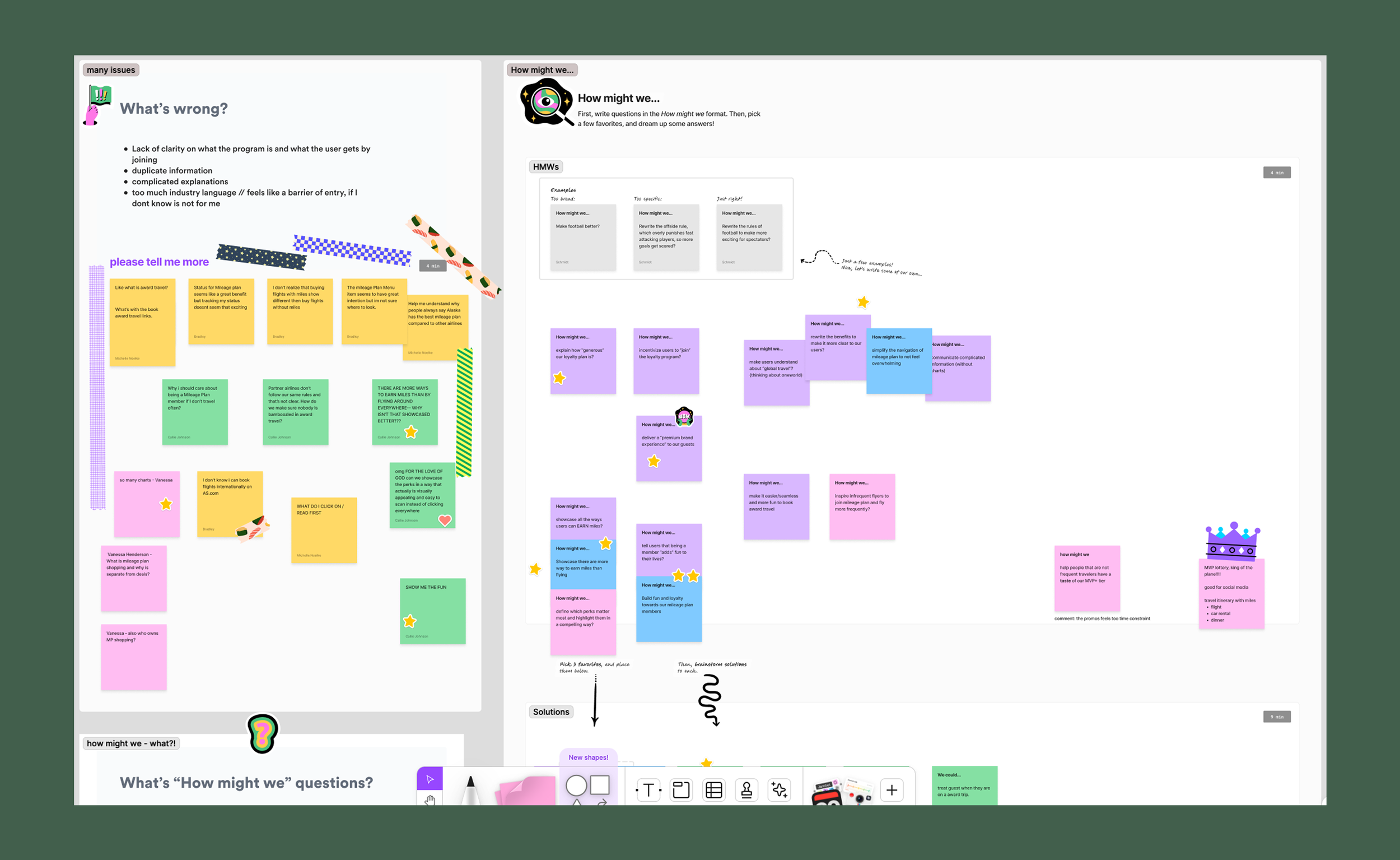
A key agreement was to shift the language to be more engaging and clearly show how the loyalty program enhances the product experience.
Discovery workshops
Facilitating collaborative discovery workshops with cross-functional teams was essential for gathering diverse perspectives and building shared ownership of the problem and potential solutions. These sessions, involving design, ux writers, and marketing, allowed us to align on key messaging goals and identify opportunities for a more engaging user experience.
This process pinpointed outdated information, redundancies, broken links, and missing content.
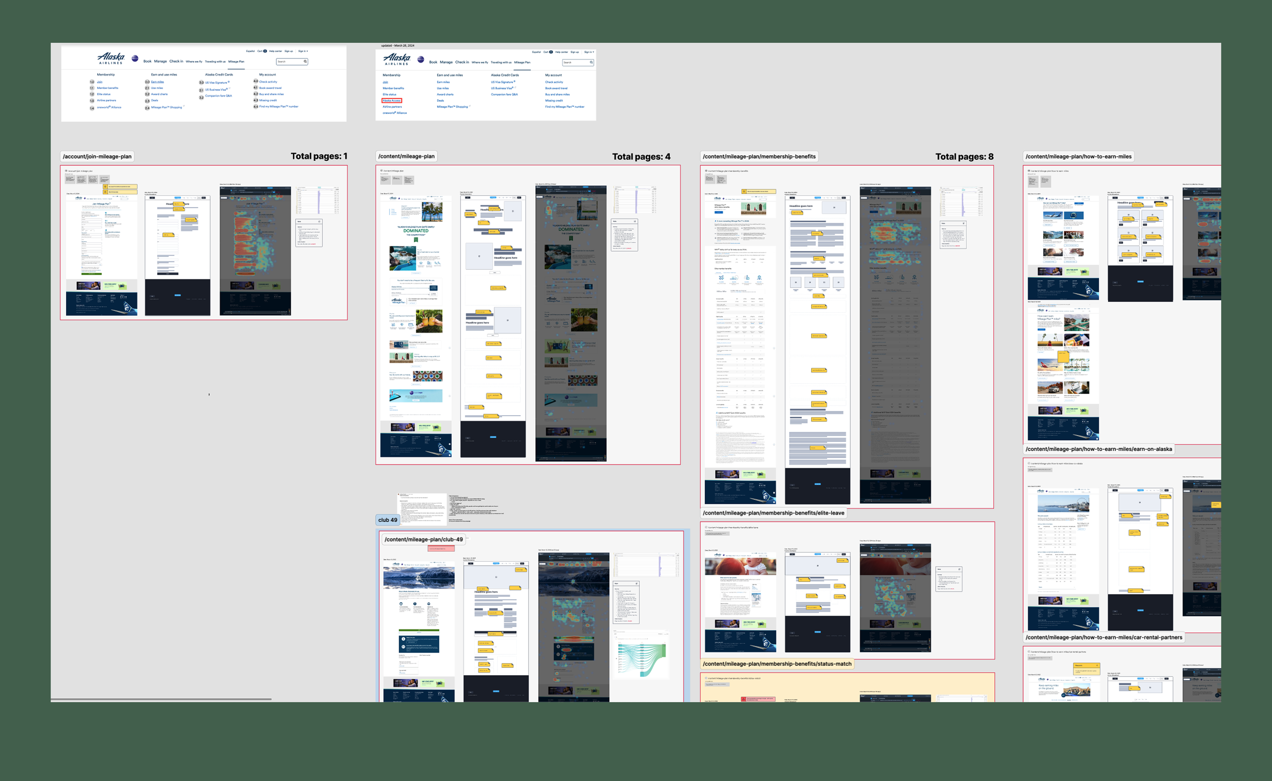
Content Audit
To really understand the existing marketing content, I did a thorough check. This meant making a visual map of the site, looking at what was on each page, and checking how people were using the pages with heatmap data. This helped me spot old information, repeated content, broken links, and things that were missing. Grouping the pages by what they were about was a big step in planning the new structure.
Reorganization
Grouping pages by theme became critical for planning the new structure.
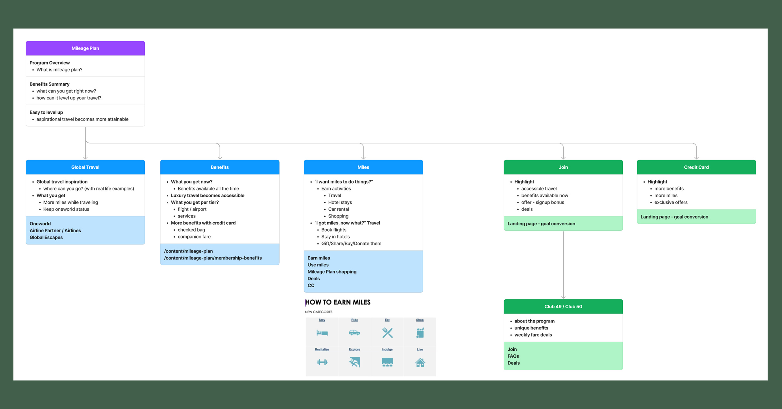
Information Architecture Development
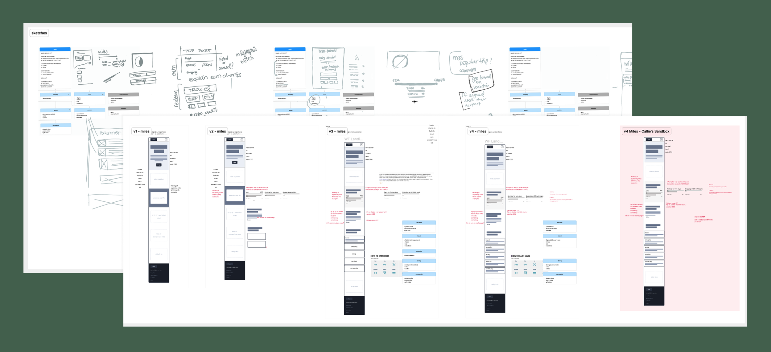
Leveraging insights from card sorting, the content audit, and user research, I developed a detailed sitemap and wireframes for key navigation. The IA was strategically designed to prioritize key information, such as program benefits and earning opportunities, while also considering future app integration, ultimately reducing the page count for a more streamlined experience.
Results
Using insights from card sorting, the content audit, and user research, I developed the new information architecture. I created detailed sitemaps and wireframes to ensure logical navigation. The new IA was designed to highlight immediate benefits, clarify point earning opportunities with visuals, and showcase global partnerships. I also ensured the structure considered future mobile app integration. This effort reduced the website from 55 pages to a streamlined 25.
While the new marketing pages are still being implemented, stakeholder feedback has been very positive. Upon presentation to the Design and Experience Director, the new structure was recognized for its clarity and potential to significantly improve user experience. This formal approval validates the strategic value of the redesign. The reduction in page count is a tangible achievement projected to streamline the user journey, increasing clarity and boosting successful enrollment and engagement once live.
Reflections
What I did
As the Lead Product Designer, I led this information architecture overhaul. My responsibilities included conducting the content audit, facilitating cross-functional discovery workshops, synthesizing user research findings, and developing the new structure. I worked closely with the loyalty marketing team to align with business goals, with designers and senior writer for consistent user experience and messaging, and with the product manager to keep the project on track. I compiled all findings and proposed solutions, presenting them to stakeholders for approval.
What I learned
This project reinforced the importance of staying organized with detailed notes and clear next steps, especially while managing multiple projects. Open communication and asking questions across different teams, even about a long-standing program, provided valuable insights for the redesign. Ultimately, it highlighted how key both organization and clear communication are for successful teamwork.
Scope Deliver a new information architecture for the loyalty marketing content
Tools Figma, Figjam, Quatum Metric, usertesting.com